Joy+
Joy+ is a fitness app targeted towards young individuals. In this project, I am committed to creating an platform to motivates users to embark on their fitness journey, placing user experience at the heart of the design.
Introduction
Welcome to a deep dive into one of my favorite projects! I'm excited to walk you through this journey, revealing how I navigated from the initial concept to the final realization. It's a story of innovation, resilience, and problem-solving, and I'm thrilled to share this intimate look at the process that led to the successful completion of this endeavor.
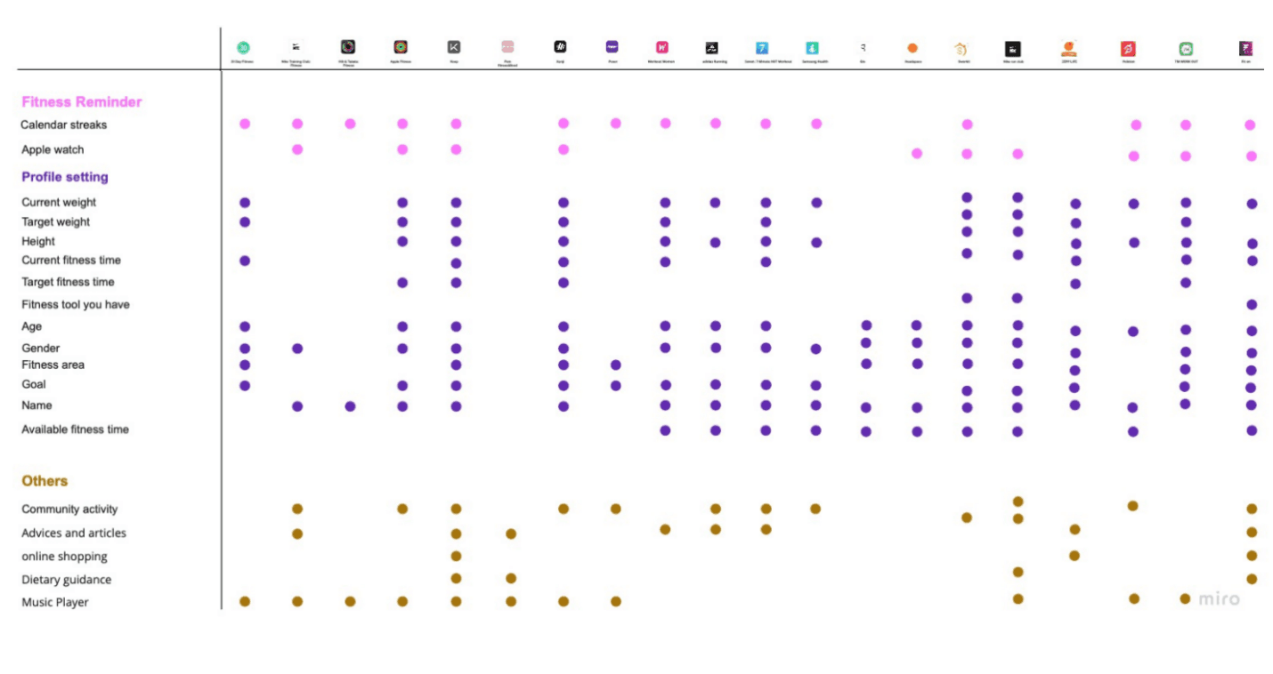
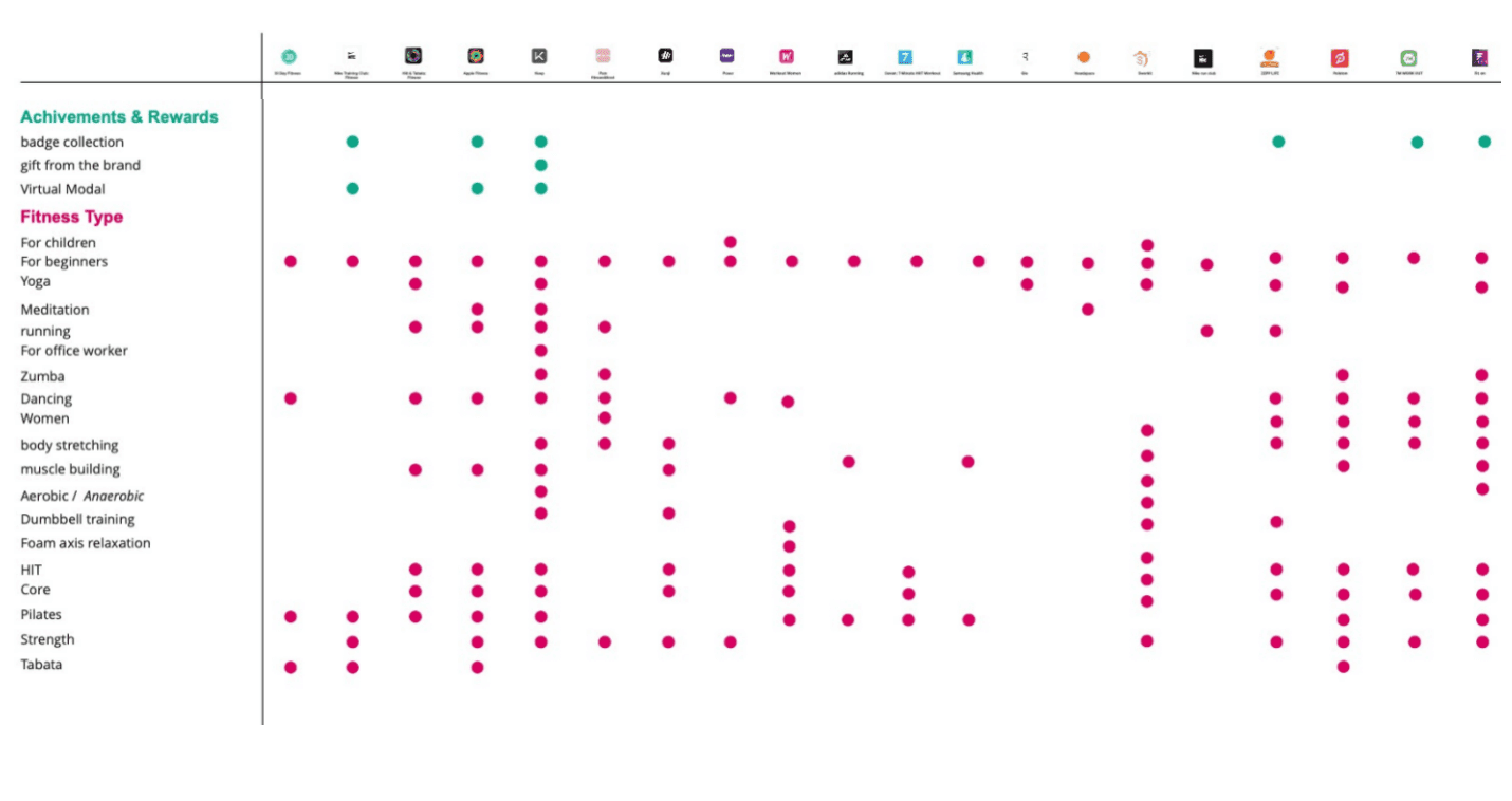
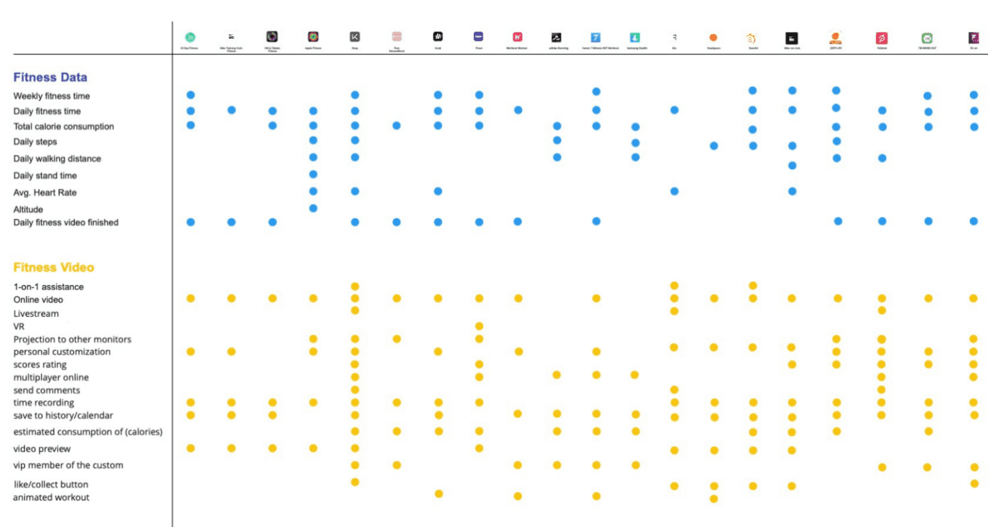
Comparative Analysis
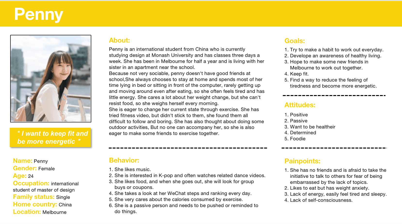
Persona
Scenario
After a day of class on Monday, penny came home and chose to stay in bed playing with her phone and eating snacks. When she weighed herself the next morning, she realized she had gained weight and became anxious. But in the face of delicious food, she couldn't resist, and the sedentary lifestyle made her feel sleepy from time to time, so she was going to change her current state by exercising from now. But she didn't like these exercises and found them difficult, so she couldn't stick to them.
Penny has a hard time getting up in the morning to go to class. During class, she always feels sleepy,and she rarely moving around at home. One day,when she came home from school, she was tired, so after finishing dinner, she wanted to lie in the bed to do some homework. she picked out the snacks she just bought in the afternoon and prepares to sit down, but she remembered her morning weight and start feeling anxious. So she thought about doing some exercise. She chose to exercise at home and she opened the dancing app that she had seen on the social media.
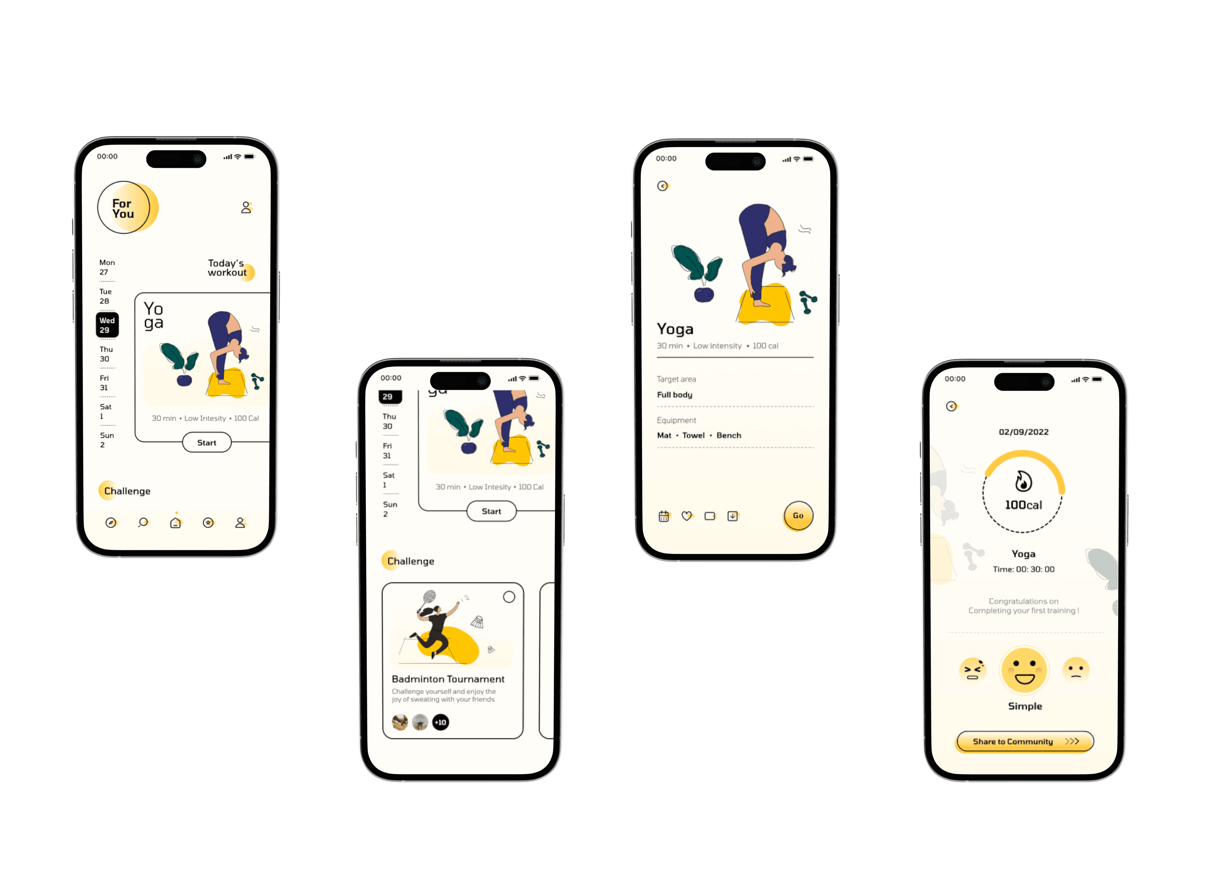
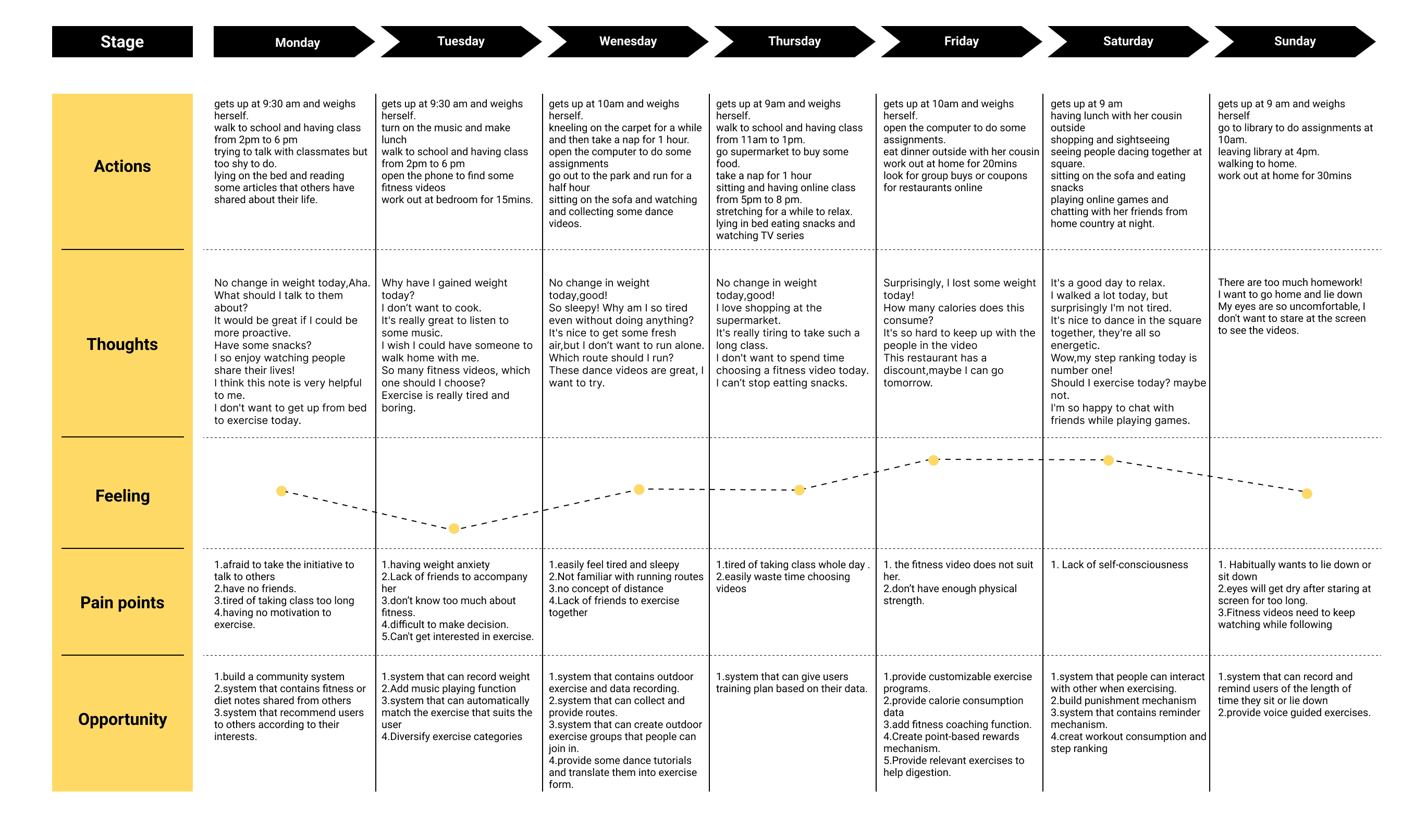
Journey Map
Moodboard
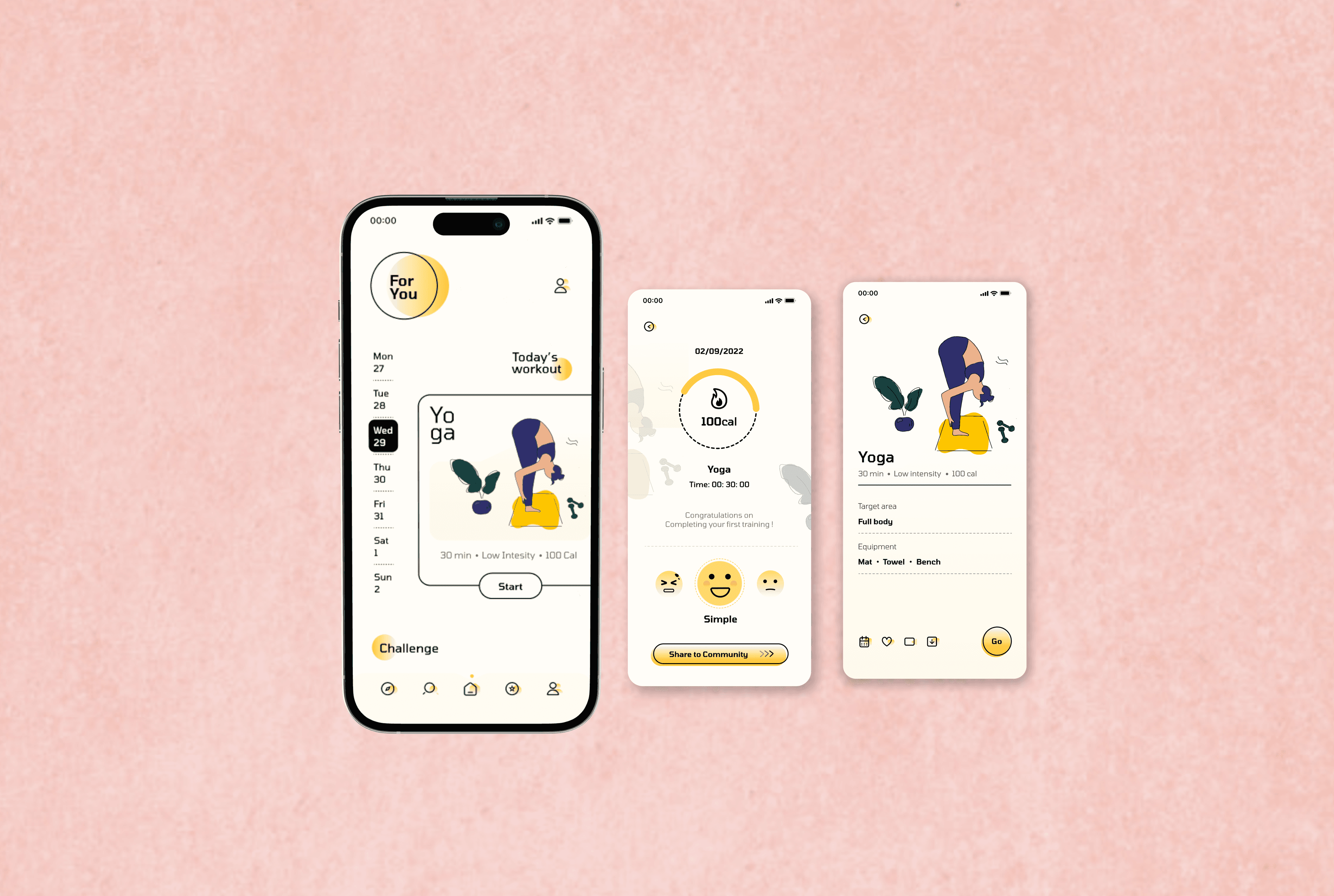
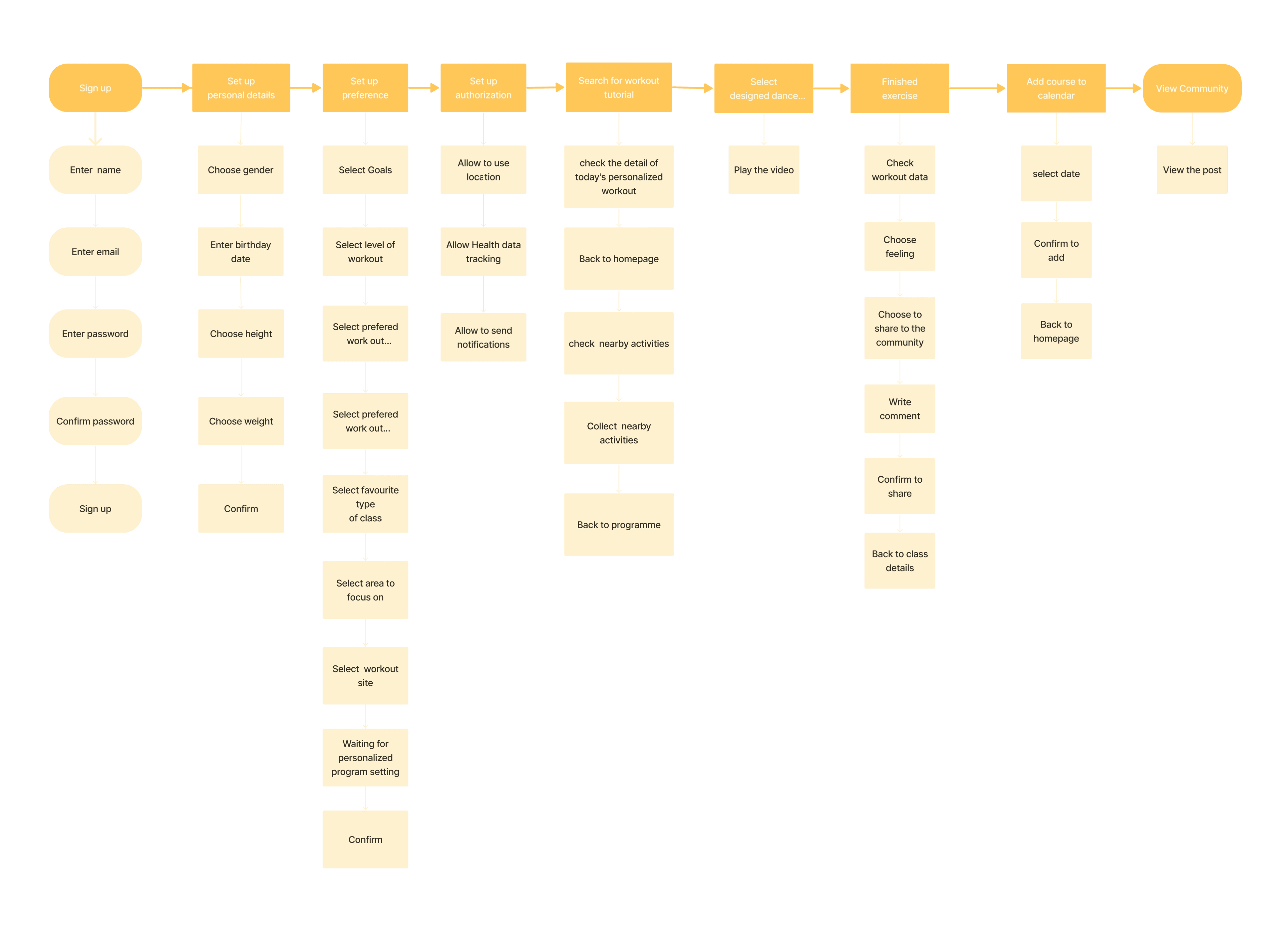
User Flow
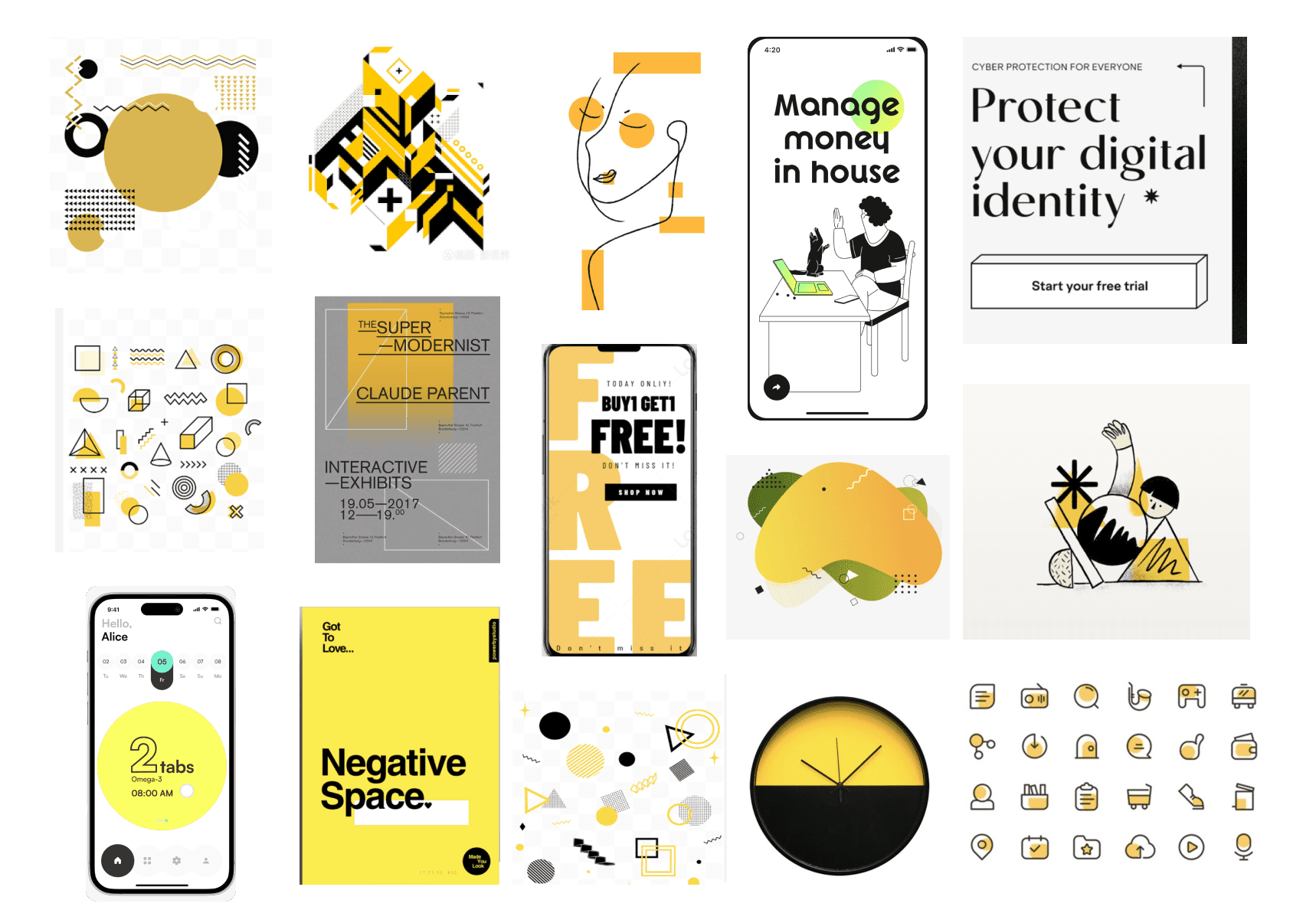
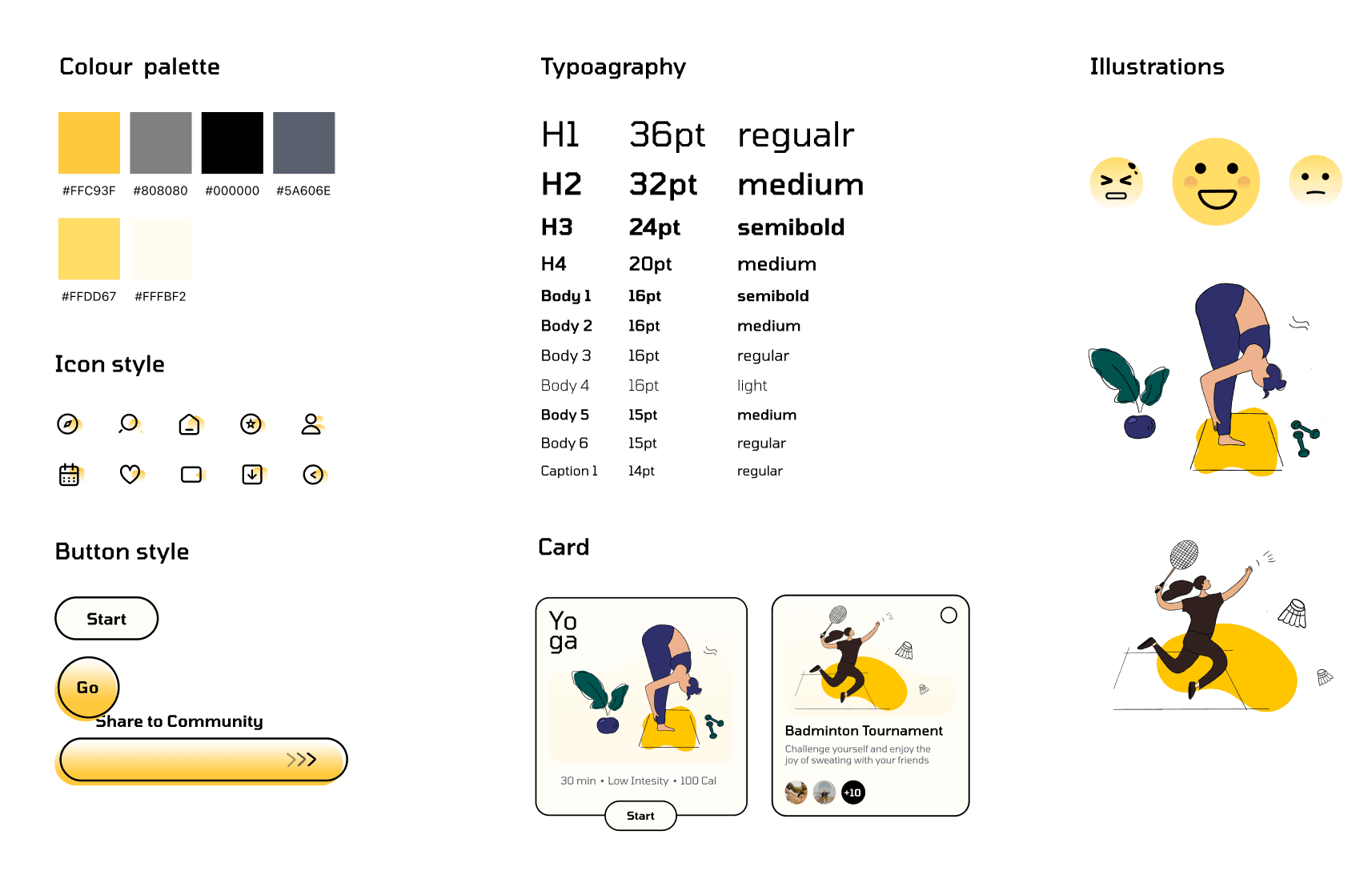
Visual Design Concept
Flat / Illustrated / Geometric /Young / Dynamic / Fun / Gradient
The interface employs wireframes and simple geometric elements as the primary design elements, creating a layered and comfortable appearance that is also user-friendly for understanding and operation.
The color palette consists of yellow and black, combined with gradients, giving the overall interface a lively and dynamic feel, while also providing visual focal points. This combination gives user a sense of youthfulness and vitality.
The use of flat illustrations helps to maintain a consistent style throughout the interface, making the visuals more engaging and less monotonous. This adds fun and convenience for users to easily understand different types of exercises in a more intuitive way.
Style Tile
Design Tips
· Spacing is important!
· The arrangement between different elements should consider their logical relationship
· Elements within the interface should be consistent in style
· Support information should be displayed properly. Don't make it look like a button
· Line height should be adjusted by a percentage so that the spacing of paragraphs does not change
· Pay attention to the blank space in the interface and the blank space in the cards
· The style of icons should be consistent
· Make things simple may be the best choice
· Don't simply use auto layout
· Don't imagine when designing, but try more and compare
· Use text hierarchy
Pages