Rainbow Serpent Festival
The project aims to design a brand identity for the Rainbow Serpent Festival, creating a distinctive and appealing visual image.
Introduction
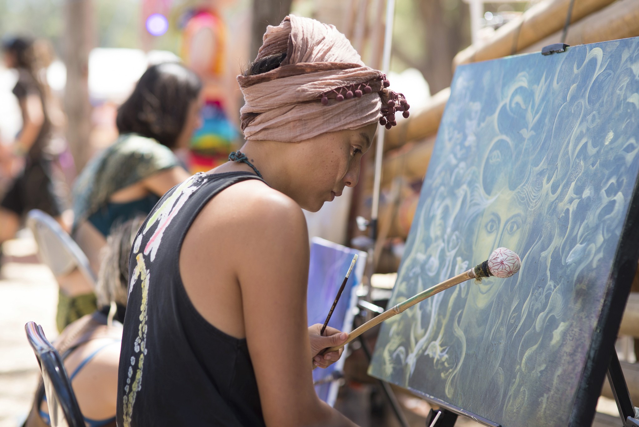
Rainbow serpent festival is more than just a music, arts and lifestyle festival. It’s a community of people with shared values seeking connection, creativity, celebration and growth. An opportunity to find each other, find ourselves and find meaning.
By blending vibrant elements, my goal is to convey the core values of joy, diversity, and community. Throughout the entire brand, I emphasize balance to ensure coherence in graphics, colors, and typography. During the design process, I delve into the essence of the event, ensuring the brand accurately captures the spirit and emotions of the Rainbow Serpent Festival. Through meticulously crafted logos, promotional materials, and digital assets, I am committed to crafting an unforgettable brand image for the festival, attracting participants and conveying positive social impact.
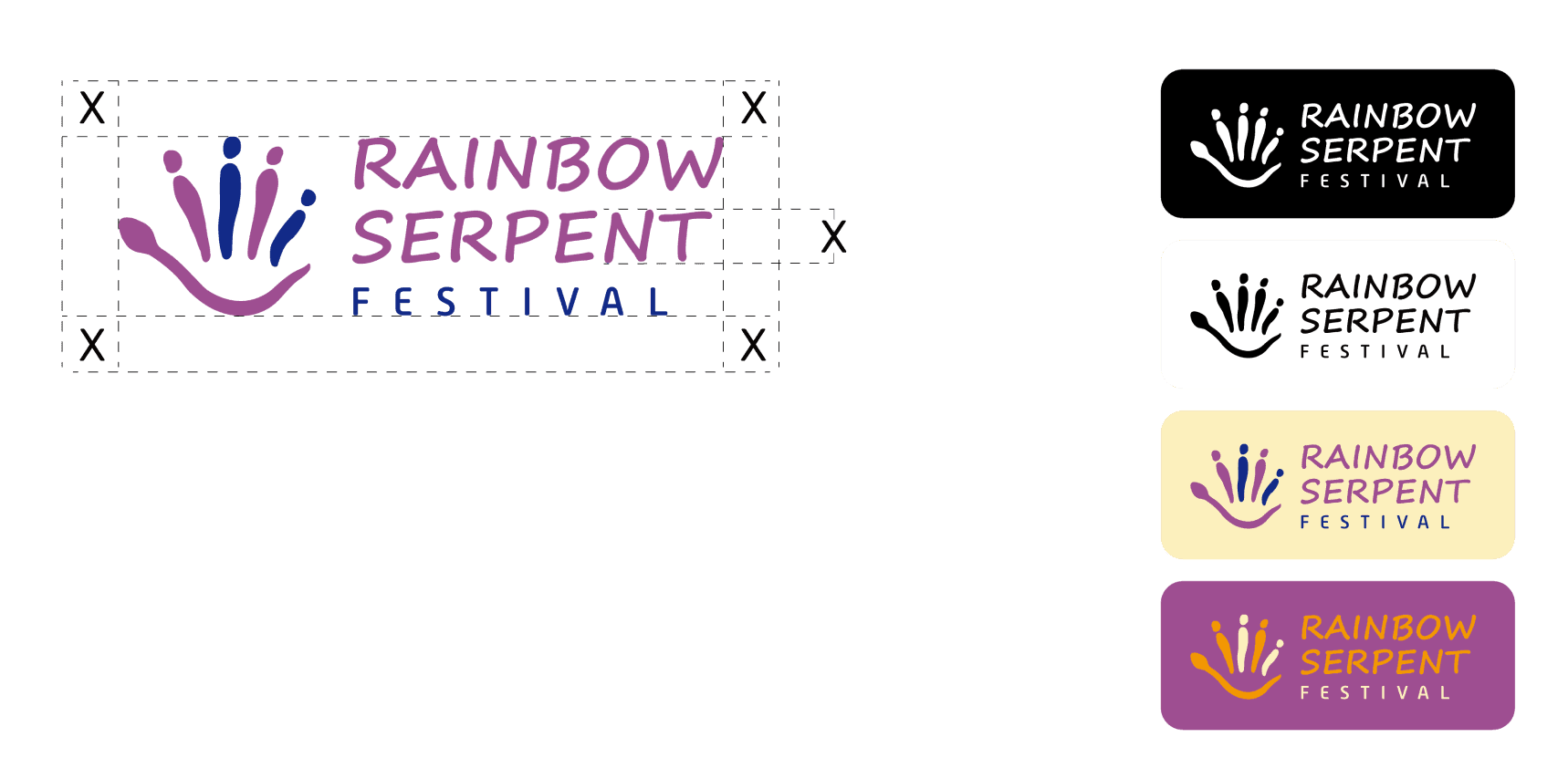
Logo Usage
The logo consists of a hand-drawn graphic and text. The graphic on the left side looks like a palm as a whole, representing the raised hands of thepeople attending the festival, and also symbolizing welcome. When viewed separately, the bottom of the palm is in the shape of a snake, symbolizing the rainbow serpent. The four fingers surrounded by the rainbow serpent represent different people coming to the festival together.
Typographic Style
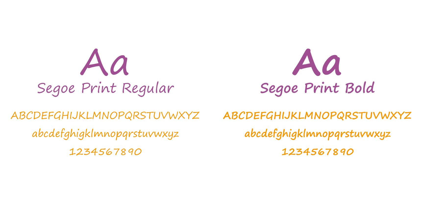
Segoe Print is a handwritten font that contains a total of two styles, and coordinates with the pattern of the hand-drawn logo and the brand graphics. It is mainly used for logo and main headlings.
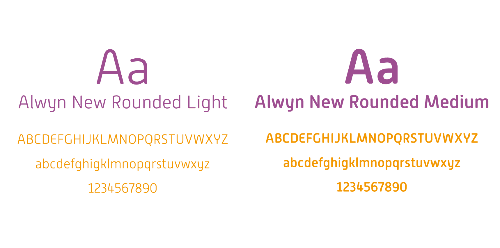
Alwyn New Rounded is a more formal typeface with a rounded look. It contains a total of ten font styles, of which light and medium are chosen. It is mainly used for body text and some information.
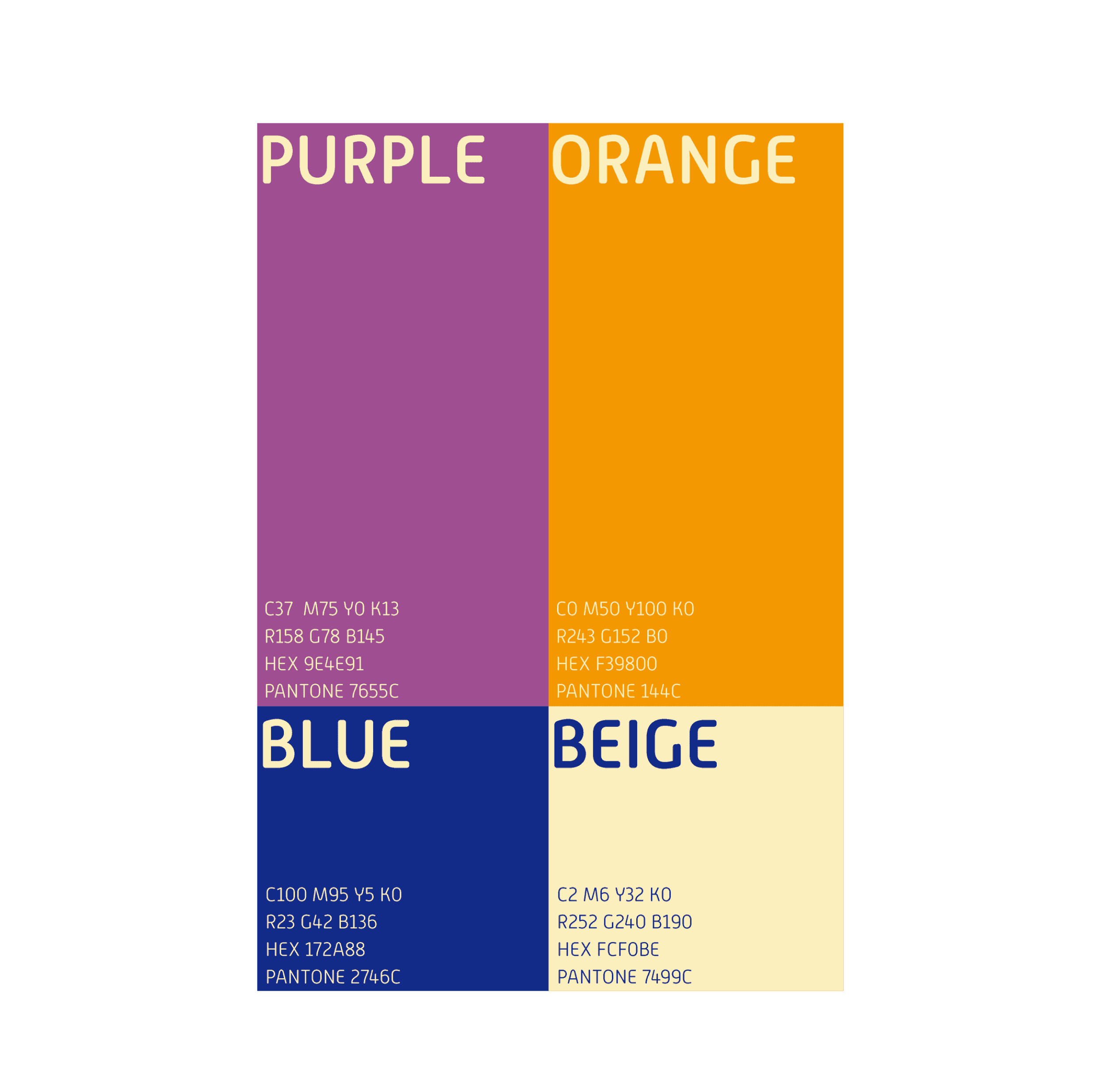
Color Palette
The brand colors are mainly purple and orange. Purple gives a sense of mystery and immersion, while orange represents creativity, vitality and open-mindedness, and these two colors are widely used for logos, auxiliary graphics and background. Blue and beige are used as auxiliary colors for for auxiliary graphics and text on light and dark backgrounds.
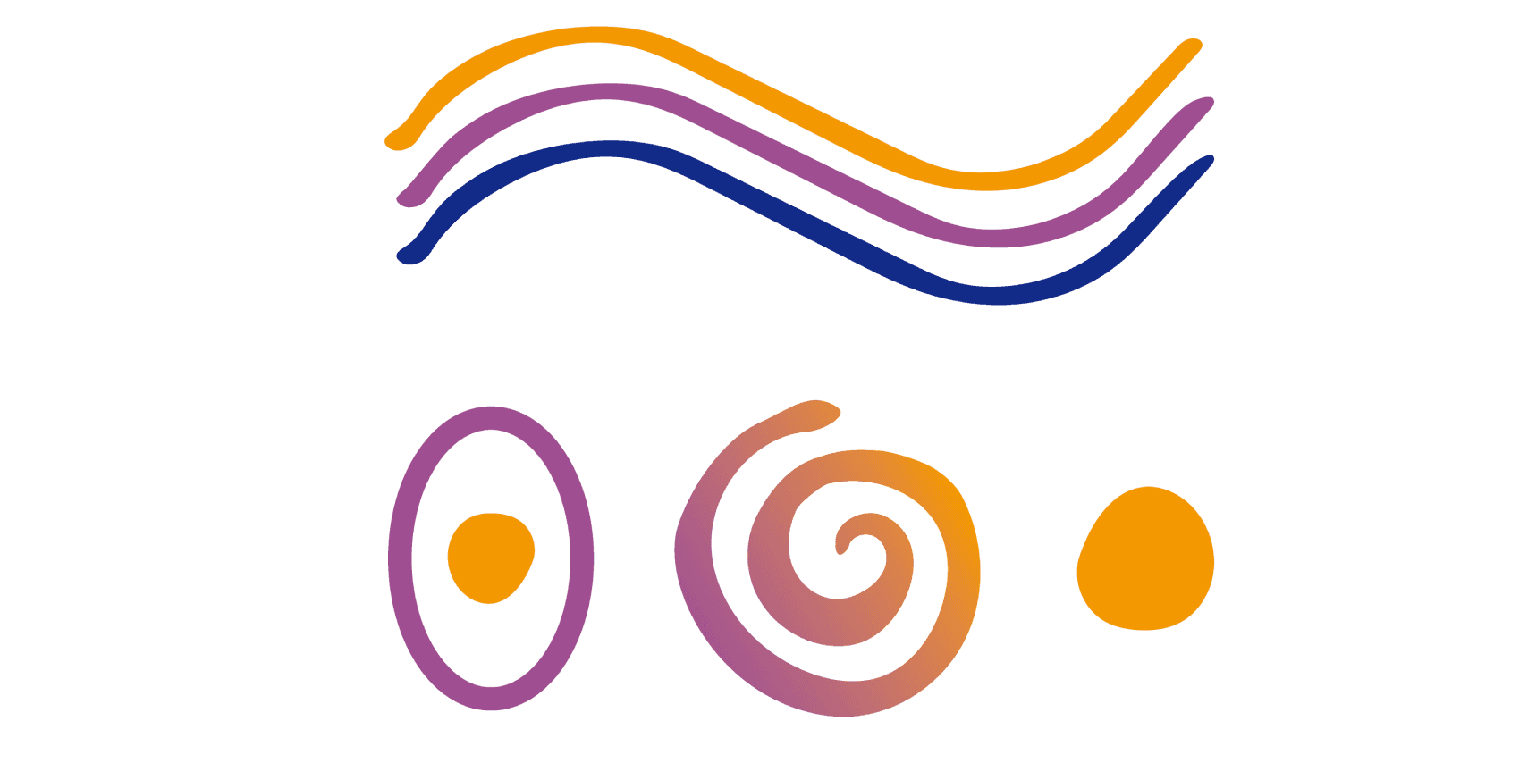
Graphics
The auxiliary graphics are all hand-drawn graphics, consistent with the logo graphic, the graphics mainly use the shape of snake, the color will be filled with different colors according to the background used.
Communication Items
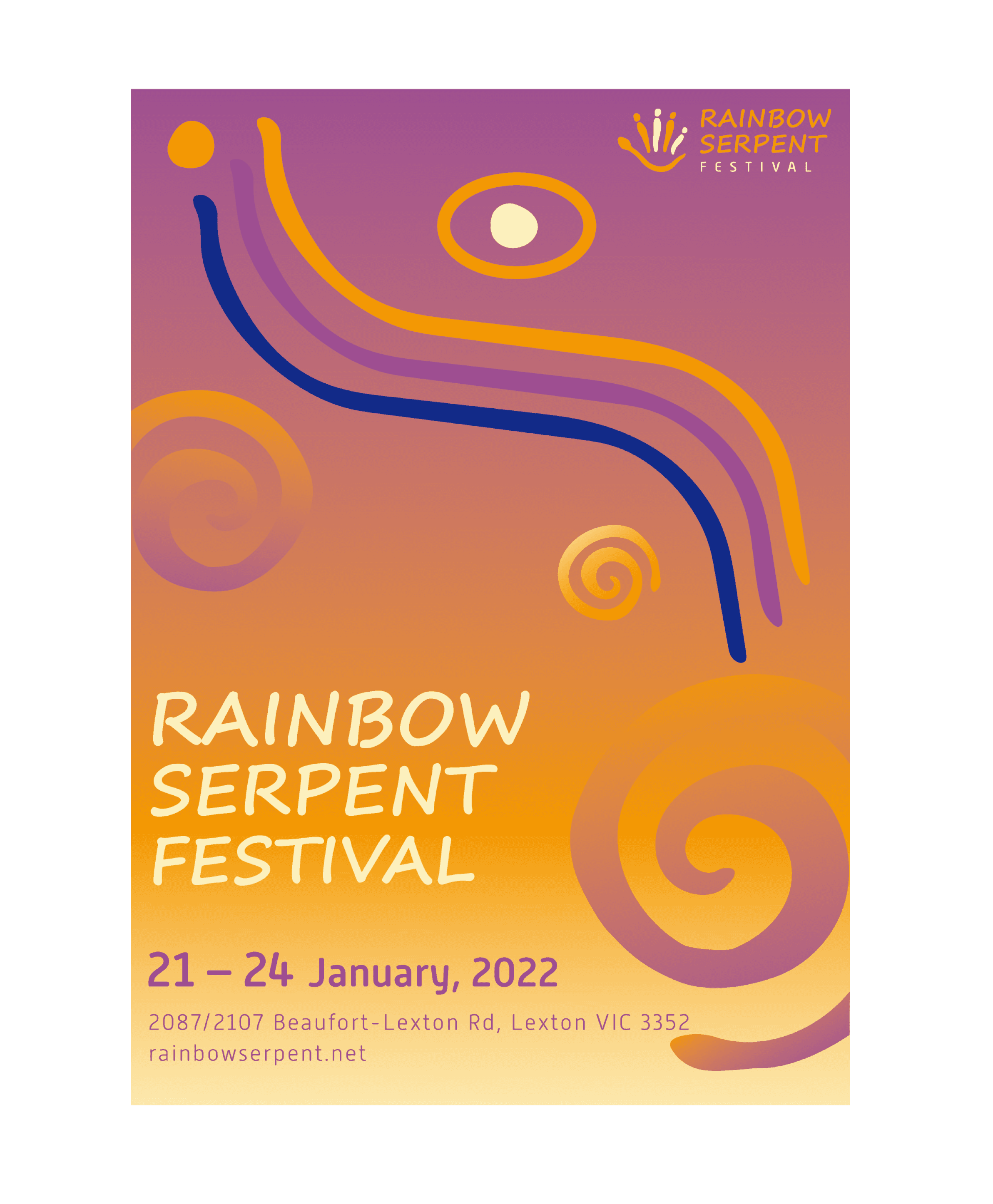
Poster
The poster use a gradient of purple and orange as the background, with the brand's logo in the upper right corner and text messages in the lower left corner, enlarging the Rainbow Serpent Festival as the main message. Various graphics are used as decoration around the texts,and they will be filled with different colors depending on the background color.
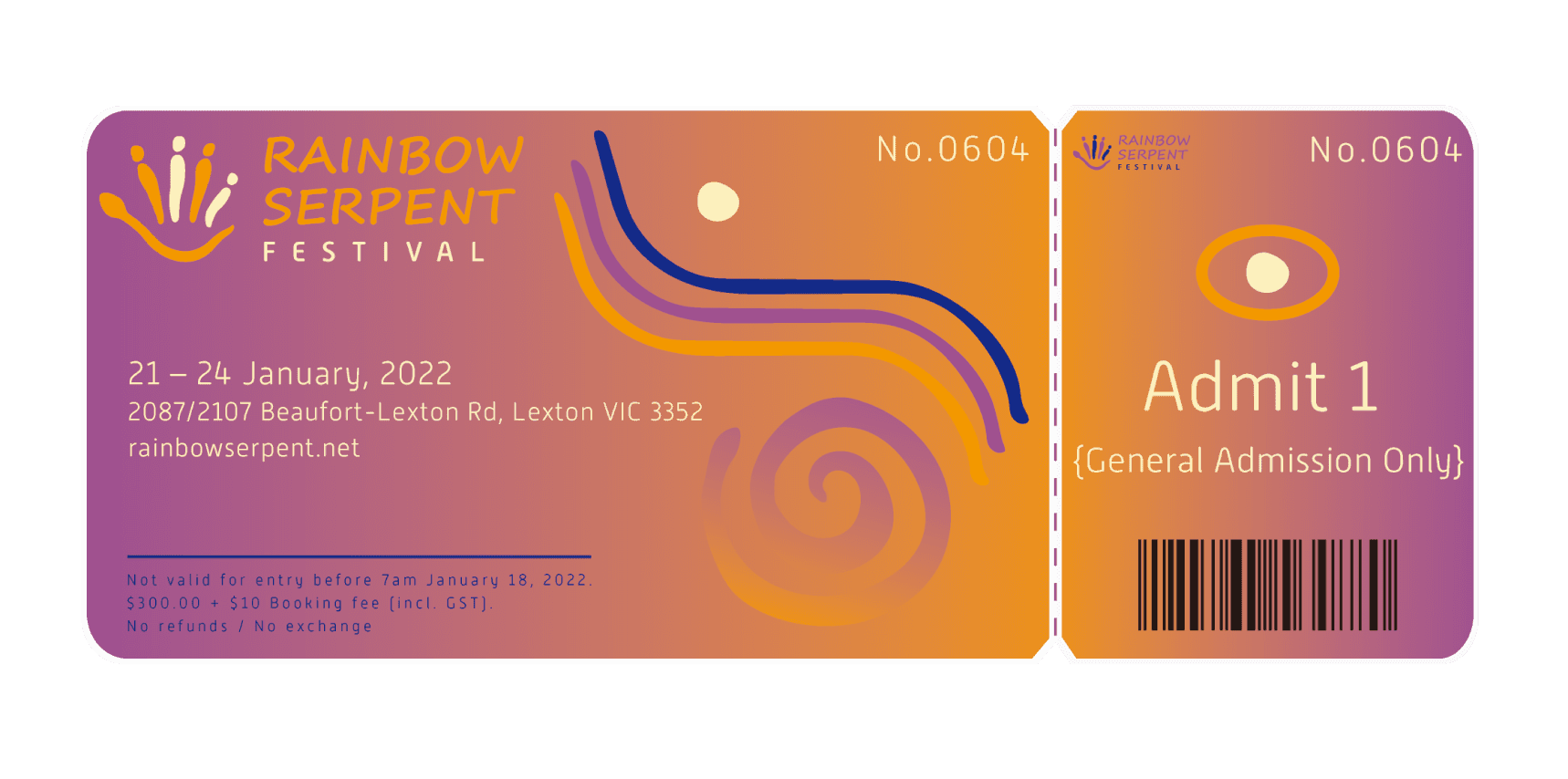
Ticket
The ticket style is consistent with the poster style, using a gradient color as the background color, with a small number of graphics as decoration to highlight the brand
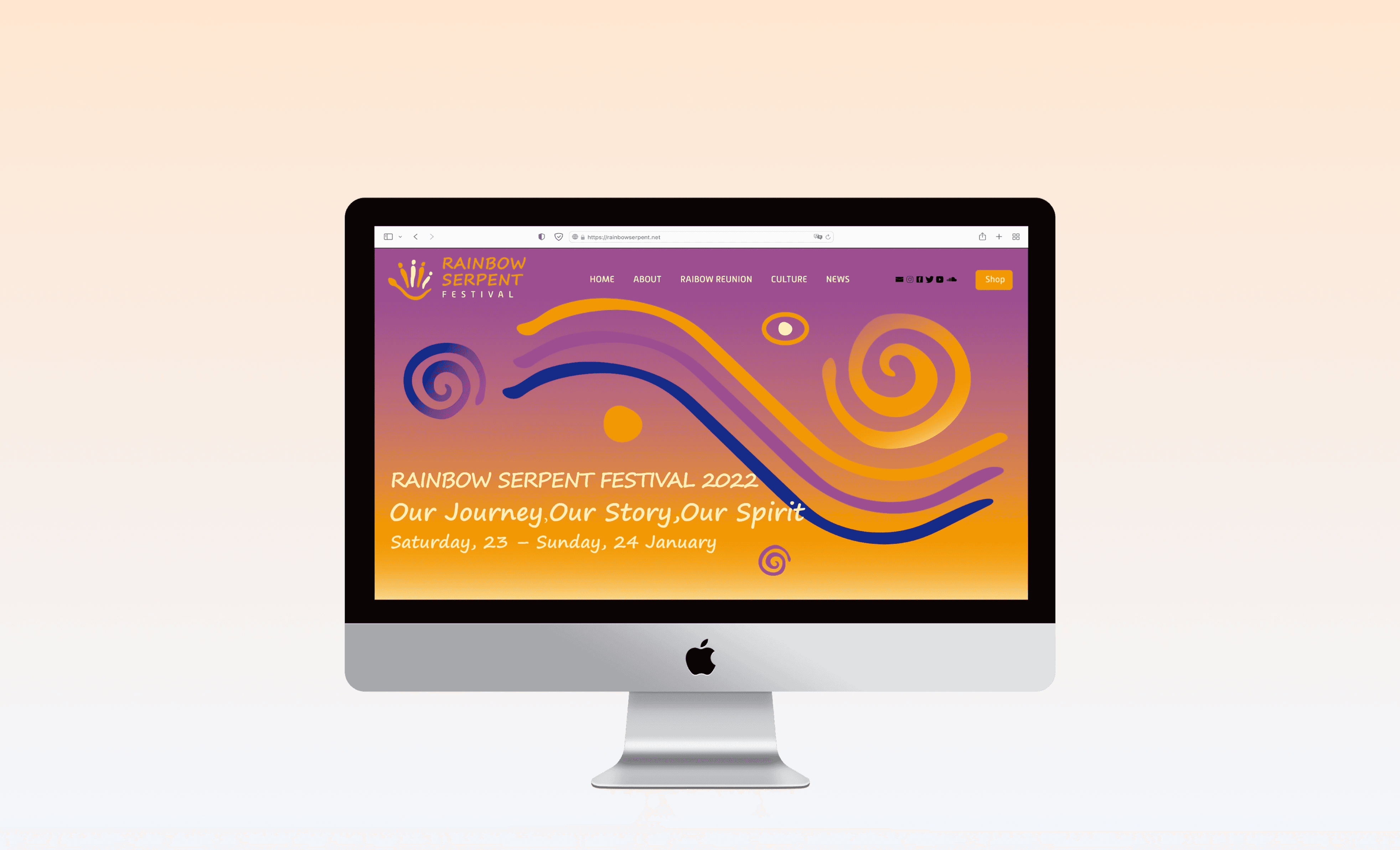
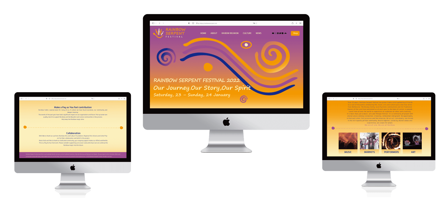
Web Homepage
The home page is divided into different part to show different information. The background uses gradient colours and some graphics to show the brand
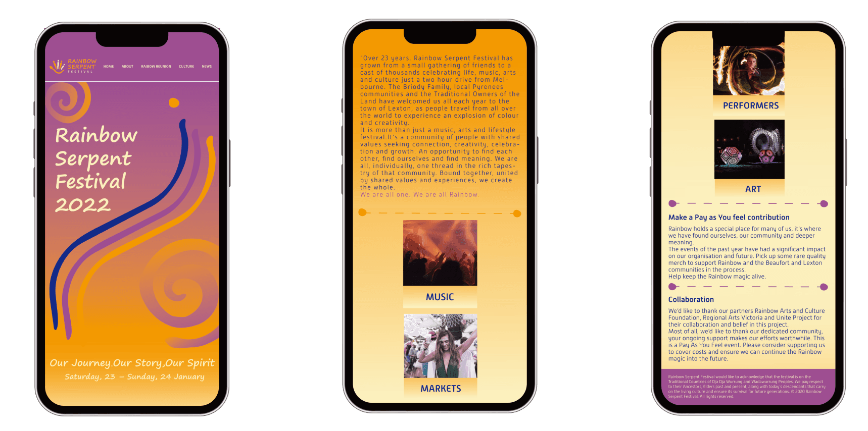
Mobile Homepage
The home page is divided into different part to show different information. The background uses gradient colours and some graphics to show the brand